


Remember that Love Live! fruit advert with a poster that kinda made it look like Chika's crotch was visible? The same one that caused a big stink on social media? The one where fans of Love Live! managed to convince agricultural group JA Nansun to keep going forward with the collaborative campaign despite all the criticism? Because JA Nansun have revealed their next poster featuring Chika and people still aren't happy, but for different reasons.
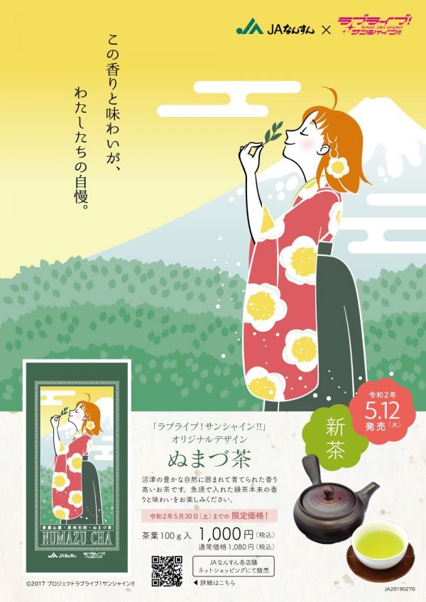
Here's the latest offending image, an advert for Numazu Cha tea. A minimalist, almost ukiyo-e-esque illustration that shows Chika dressed rather chastely in a kimono as she blissfully inspects a tea leaf. It couldn't be more different from the last advert, even right down to its reception. The same people that complained about the last one are actually praising this poster, citing that it's more tasteful, the lack of hidden panty shots making it more suited for general audiences, and it has a certain traditional Japanese aesthetic about it. This time, it's the Love Live! fans that are mad.
Love Livers, particularly the Japanese ones, have a special devotion to their teen idol waifus. Sure, no one's complaining that the new poster isn't lewd enough, but plenty are saying that it isn't Love Live-ly enough. The last poster unmistakably features Chika Takami from Love Live! Sunshine!!, but some say if this one didn't have the logo in the top left it could be any generic, orange-haired girl. Others are complaining that JA Nansun intentionally softened the design this time around to appease the feminists that started the outrage in the first place, betraying the tens of thousands of otaku that defended them a few weeks ago.
This ordeal goes to show that you really can't please everyone. But enough of that, what do you guys think? Are JA Nansun pandering to the woke crowd or is just a wholesome new change of art style? Sound off below!


My only complaint is that people should draw better. That's about it.