


The official logo for the upcoming World Expo in Japan has been revealed and, as you can see above, it's kind of a mess.
Organized by the Bureau of International Expositions, World Expos are held in a different country usually every five or so years. They give different nations a chance to showcase their culture to the rest of the world along with a unique theme. Osaka's 2025 expo is set to focus on "Designing Future Society for Our Lives", along with saving, connecting, and empowering lives, which I think we can all agree sounds like exactly what we need in these trying times. But why have they gone with such a weird logo? It looks like a multiocular angel from the Old Testament. Or an inflamed butthole. Or a genetic experiment gone horribly wrong. I don't think I've seen an approved logo for a worldwide event this bad since the London Olympics.
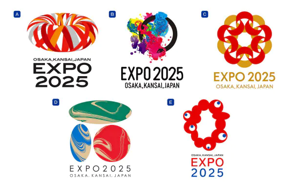
This thing was somehow chosen over 5,984 much better-looking logos. Here are the rest of the top 5 for comparison.
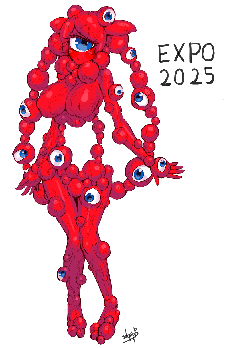
55-year-old Osakan artist Tamotsu Shimada designed it, and even he's surprised it was selected by the organizers. He said it was meant to represent "the bright light of life," with the white space in the middle resembling the shape of the Kansai region and the eyeball-looking things serving as a strange callback to the 1970 Osaka World Expo's sakura-inspired logo. Frankly, I don't see it, and neither do a lot of Japanese social media users. Some compare it to one of the Cronenberg-esque hosts from Parasyte, or the ugly cute Mitty from Made in Abyss. It's earned the nickname Inochi no Kagayaki-kun (Bright Life of Light-kun) and inspired a ton of weird and wonderful fanart.


And yes, that means lewds as well.


So, do you think Expo 2025's logo is fitting for the event? Or do you prefer the lewds and fanart of Inochi no Kagayaki-kun? Drop your thoughts below!


Japan is the most WTF country on the planet.